Rapid Cycle A/B Testing = Rapid Results
Rapid Cycle A/B Testing = Rapid Results
What is A/B Testing? As the name implies, A/B testing is simply comparing two versions (A and B) of an ad, web page, or other content, which are identical except for a slight variation that might affect a user’s behavior. Version A is often the current version (control), while Version B is modified in some way (treatment). E-commerce websites are typically a perfect candidate for A/B testing, as even marginal improvements in drop-off rates can represent a significant gain in sales. These improvements can be seen through testing elements like text, layouts, images, and colors.
Simply put, A/B testing is an easy way to test changes to online content to determine which variation produces the best results.
Testing takes the guesswork out of website optimization and enables data-backed decisions that shift business conversations from “we think” to “we know.” By measuring the impact that changes have on your metrics such as sign-ups, downloads, purchases, or whatever your goals may be, you can ensure that every change produces positive results. Sure, you might have hunches about what design elements work best for your website. However, A/B testing allows you to show visitors two versions of the same page and let them determine the winner. Constantly testing and optimizing your page can increase revenue, donations, leads, registrations, downloads, and user generated content, while providing your team with invaluable insight about their visitors.
Recently SmartClick has started using a service called Optimizely that allows us to run A/B tests in a simple WYSIWYG editor. This means that we can run tests rapidly and without having to involve a Webmaster, which ultimately saves our clients time and money. It also allows us to see if changes to a page are successful before changing the websites master template or code permanently.
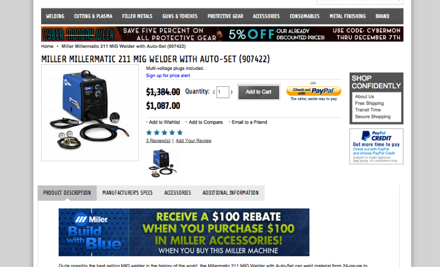
A recent Optimizely test with a client of ours that sells welding supplies shows just how powerful these rapid cycle tests can be in driving results. Below is an image of the original product page for their website.
Using Google Analytics, we were able to see the actions users were currently taking on this page. This allowed us to hypothesize a few different changes that might increase conversions (sales) for this product page. Here is a list of the items that we decided to change.
1. The add to cart button is grey and blends in with the rest of the site, so we decided to change it to a brand-appropriate, but much more eye-catching yellow.
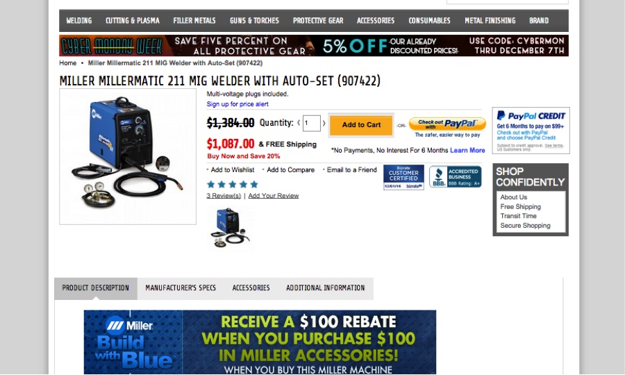
2. The sale price of this item is highlighted by a simple strikethrough, but this could be much more emphasized, so we changed it to a red color for the new price. In addition, we also added a small amount of text below the price stating the amount of savings (20%) as well as a call to action to Buy Now.
3. All items over $50 ship free for this client, so we added a small amount of text to the right of the price to highlight that it ships for free.
4. A small hyperlink was added under the “add to cart” button for more information about 6 month interest free financing through Paypal.
5. Lastly, trust signals (BBB link and Bizrate link) were added above the fold to reassure the customer that this is a legitimate website.
Below is a screenshot of the modified design.
This test ran for just over a month and was a huge success. A breakdown of the results can be seen below.
A (original version): Conversion rate = 1.57% Revenue Per Visitor = $34.41
B (revised version): Conversion rate = 1.94% Revenue Per Visitor = $56.49
Overall the B version saw a 23.4% improvement in conversion rate and a 64.2% improvement in total revenue.
This example clearly shows the power of A/B testing. In some cases a simple change to a product page can double revenue. The changes made to this product page may look simple, but the results are astounding!
To learn more about A/B testing for your website, contact us.


No Comments